有没有办法检查用户使用的是平板电脑还是手机?我的倾斜功能和我的新平板电脑(变压器)有问题
86489 次
30 回答
123
如前所述,您不想检查设备是平板电脑还是手机,但您想了解设备的功能,
大多数情况下,平板电脑和手机之间的区别在于屏幕尺寸,这就是您要使用不同布局文件的原因。这些文件存储在res/layout-<qualifiers>目录中。您可以在目录中为每个布局创建一个 XML 文件,res/values-<same qualifiers>并将 int/bool/string 资源放入其中以区分您使用的布局。
例子:
文件res/values/screen.xml(假设res/layout/包含您的手机布局文件)
<?xml version="1.0" encoding="utf-8"?>
<resources>
  <string name="screen_type">phone</string>
</resources>
文件res/values-sw600dp/screen.xml(假设res/layout-sw600dp/包含 Nexus 7 等小型平板电脑的布局文件)
<?xml version="1.0" encoding="utf-8"?>
<resources>
  <string name="screen_type">7-inch-tablet</string>
</resources>
文件res/values-sw720dp/screen.xml(假设res/layout-sw720dp/包含 Nexus 10 等大型平板电脑的布局文件):
<?xml version="1.0" encoding="utf-8"?>
<resources>
  <string name="screen_type">10-inch-tablet</string>
</resources>
现在可以通过R.string.screen_type常量访问屏幕类型。
于 2013-01-17T00:11:52.040 回答
63
要检测设备是否是平板电脑,请使用以下代码:
public boolean isTablet(Context context) {
    boolean xlarge = ((context.getResources().getConfiguration().screenLayout & Configuration.SCREENLAYOUT_SIZE_MASK) == Configuration.SCREENLAYOUT_SIZE_XLARGE);
    boolean large = ((context.getResources().getConfiguration().screenLayout & Configuration.SCREENLAYOUT_SIZE_MASK) == Configuration.SCREENLAYOUT_SIZE_LARGE);
    return (xlarge || large);
}
LARGE 和 XLARGE 屏幕尺寸由制造商根据与眼睛的距离来确定(因此是平板电脑的概念)。
更多信息:http ://groups.google.com/group/android-developers/browse_thread/thread/d6323d81f226f93f
于 2012-03-06T19:29:48.210 回答
40
这个帖子对我帮助很大
不幸的是,我没有必要的声誉来评估所有对我有帮助的答案。
我需要确定我的设备是平板电脑还是手机,这样我才能实现屏幕的逻辑。在我的分析中,从 MDPI 开始,平板电脑必须超过 7 英寸(Xlarge)。
下面是基于这篇文章创建的代码。
/**
 * Checks if the device is a tablet or a phone
 *
 * @param activityContext
 *            The Activity Context.
 * @return Returns true if the device is a Tablet
 */
public static boolean isTabletDevice(Context activityContext) {
    // Verifies if the Generalized Size of the device is XLARGE to be
    // considered a Tablet
    boolean xlarge = ((activityContext.getResources().getConfiguration().screenLayout &
                        Configuration.SCREENLAYOUT_SIZE_MASK) ==
                        Configuration.SCREENLAYOUT_SIZE_XLARGE);

    // If XLarge, checks if the Generalized Density is at least MDPI
    // (160dpi)
    if (xlarge) {
        DisplayMetrics metrics = new DisplayMetrics();
        Activity activity = (Activity) activityContext;
        activity.getWindowManager().getDefaultDisplay().getMetrics(metrics);

        // MDPI=160, DEFAULT=160, DENSITY_HIGH=240, DENSITY_MEDIUM=160,
        // DENSITY_TV=213, DENSITY_XHIGH=320
        if (metrics.densityDpi == DisplayMetrics.DENSITY_DEFAULT
                || metrics.densityDpi == DisplayMetrics.DENSITY_HIGH
                || metrics.densityDpi == DisplayMetrics.DENSITY_MEDIUM
                || metrics.densityDpi == DisplayMetrics.DENSITY_TV
                || metrics.densityDpi == DisplayMetrics.DENSITY_XHIGH) {

            // Yes, this is a tablet!
            return true;
        }
    }

    // No, this is not a tablet!
    return false;
}
于 2012-03-08T20:58:21.350 回答
12
为什么不计算屏幕对角线的大小并用它来决定设备是手机还是平板电脑?
private boolean isTablet()
{
    Display display = getWindowManager().getDefaultDisplay();
    DisplayMetrics displayMetrics = new DisplayMetrics();
    display.getMetrics(displayMetrics);

    int width = displayMetrics.widthPixels / displayMetrics.densityDpi;
    int height = displayMetrics.heightPixels / displayMetrics.densityDpi;

    double screenDiagonal = Math.sqrt( width * width + height * height );
    return (screenDiagonal >= 9.0 );
}
当然,人们可以争论阈值是否应该是 9 英寸或更小。
于 2012-02-17T09:50:56.913 回答
11
没有区别。您应该定义您认为的差异,并检查它。银河标签是手机吗?还是平板电脑?为什么?
您应该定义您正在寻找的特定功能,并为此编写代码。
看来您正在寻找“倾斜”。我认为这与加速度计相同(这是一个词吗?)。您可以使用以下方法检查设备是否支持它:
public class Accel extends Activity implements SensorListener {
...
  SensorManager sensorMgr = (SensorManager) getSystemService(SENSOR_SERVICE);
  boolean accelSupported = sensorMgr.registerListener(this,
        SENSOR_ACCELEROMETER,
        SENSOR_DELAY_UI);
...
}
(来自http://stuffthathappens.com/blog/2009/03/15/android-accelerometer/。我没有测试过)
于 2011-04-29T13:02:08.543 回答
10
我的假设是,当您定义“手机/电话”时,您想知道是否可以在设备上拨打电话,而这在被定义为“平板电脑”的设备上是无法完成的。验证方法如下。如果您想了解基于传感器、屏幕尺寸等的信息,那么这确实是一个不同的问题。
此外,虽然使用屏幕分辨率或资源管理 large vs xlarge,在过去可能是一种有效的方法,新的“移动”设备现在配备了如此大的屏幕和高分辨率,以至于如果你真的希望的话,它们会模糊这条线要了解电话与没有电话功能,以下是“最好的”。
TelephonyManager manager = (TelephonyManager)context.getSystemService(Context.TELEPHONY_SERVICE);
if(manager.getPhoneType() == TelephonyManager.PHONE_TYPE_NONE){
    return "Tablet";
}else{
    return "Mobile";
}
于 2012-06-14T21:22:10.380 回答
8
基于 Robert Dale Johnson III 和 Helton Isac 我想出了这段代码希望这很有用
public static boolean isTablet(Context context) {
    TelephonyManager manager =
        (TelephonyManager)context.getSystemService(Context.TELEPHONY_SERVICE);
    if (manager.getPhoneType() == TelephonyManager.PHONE_TYPE_NONE) {
        //Tablet
        return true;
    } else {
        //Mobile
        return false;
    }
}

public static boolean isTabletDevice(Context activityContext) {
    // Verifies if the Generalized Size of the device is XLARGE to be
    // considered a Tablet
    boolean xlarge =
         ((activityContext.getResources().getConfiguration().screenLayout &
           Configuration.SCREENLAYOUT_SIZE_MASK) == Configuration.SCREENLAYOUT_SIZE_XLARGE);

    // If XLarge, checks if the Generalized Density is at least MDPI (160dpi)
    if (xlarge) {
        DisplayMetrics metrics = new DisplayMetrics();
        Activity activity = (Activity) activityContext;
        activity.getWindowManager().getDefaultDisplay().getMetrics(metrics);

        // MDPI=160, DEFAULT=160, DENSITY_HIGH=240, DENSITY_MEDIUM=160,
        // DENSITY_TV=213, DENSITY_XHIGH=320
        if (metrics.densityDpi == DisplayMetrics.DENSITY_DEFAULT
                  || metrics.densityDpi == DisplayMetrics.DENSITY_HIGH
                  || metrics.densityDpi == DisplayMetrics.DENSITY_MEDIUM
                  || metrics.densityDpi == DisplayMetrics.DENSITY_XHIGH) {

             // Yes, this is a tablet!
             return true;
        }
    }

    // No, this is not a tablet!
    return false;
}
所以在你的代码中做一个过滤器
if(isTabletDevice(Utilities.this) && isTablet(Utilities.this)){
    //Tablet
} else {
    //Phone
}
于 2012-09-14T02:26:54.083 回答
7
在 Google IOSched 2017 app source code中,使用了以下方法:
public static boolean isTablet(Context context) {
    return context.getResources().getConfiguration().smallestScreenWidthDp >= 600;
}
于 2018-02-19T12:57:21.380 回答
3
对于那些想要参考谷歌决定哪些设备将使用平板电脑 UI 的代码的人可以参考以下内容:
  // SystemUI (status bar) layout policy
        int shortSizeDp = shortSize
                * DisplayMetrics.DENSITY_DEFAULT
                / DisplayMetrics.DENSITY_DEVICE;

        if (shortSizeDp < 600) {
            // 0-599dp: "phone" UI with a separate status & navigation bar
            mHasSystemNavBar = false;
            mNavigationBarCanMove = true;
        } else if (shortSizeDp < 720) {
            // 600-719dp: "phone" UI with modifications for larger screens
            mHasSystemNavBar = false;
            mNavigationBarCanMove = false;
        } else {
            // 720dp: "tablet" UI with a single combined status & navigation bar
            mHasSystemNavBar = true;
            mNavigationBarCanMove = false;
        }
        }
于 2013-01-11T18:38:37.337 回答
3
这种方法是谷歌推荐的。我在 Google 官方 Android 应用程序中看到此代码iosched
public static boolean isTablet(Context context) {
        return (context.getResources().getConfiguration().screenLayout
                & Configuration.SCREENLAYOUT_SIZE_MASK)
                >= Configuration.SCREENLAYOUT_SIZE_LARGE;
}
于 2013-11-24T14:29:43.280 回答
3
无需代码
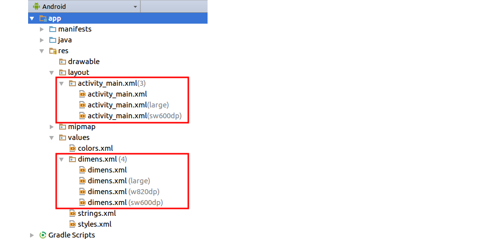
其他答案列出了许多以编程方式确定设备是手机还是平板电脑的方法。但是,如果您阅读文档,那不是支持各种屏幕尺寸的推荐方式。
相反,为平板电脑或手机声明不同的资源。你这样做我为 , 等添加额外的资源文件layout夹values。
对于 Android 3.2(API 级别 13),添加一个
sw600dp文件夹。这意味着最小宽度至少为 600dp,这大约是手机/平板电脑的差距。但是,您也可以添加其他尺寸。查看此答案以获取有关如何添加其他布局资源文件的示例。如果您还支持 Android 3.2 之前的设备,则需要添加
large或xlarge文件夹以支持平板电脑。(电话通常是small和normal。)
这是为不同的屏幕尺寸添加额外的 xml 文件后您的资源可能会喜欢的图像。
使用此方法时,系统会为您确定一切。您不必担心在运行时使用的是哪个设备。您只需提供适当的资源,让 Android 完成所有工作。
笔记
- 您可以使用别名来避免重复相同的资源文件。
值得一读的 Android 文档
于 2017-01-14T02:46:53.560 回答
2
如果您只针对 API 级别 >= 13,请尝试
public static boolean isTablet(Context context) {
    return context.getResources().getConfiguration().smallestScreenWidthDp >= 600;
}
干杯:-)
于 2015-09-08T13:04:22.143 回答
2
如果屏幕尺寸检测在较新的设备上没有返回正确的值,请尝试:
/*
 Returns '1' if device is a tablet
 or '0' if device is not a tablet.
 Returns '-1' if an error occured.
 May require READ_EXTERNAL_STORAGE
 permission.
 */
public static int isTablet()
{
    try
    {
        InputStream ism = Runtime.getRuntime().exec("getprop ro.build.characteristics").getInputStream();
        byte[] bts = new byte[1024];
        ism.read(bts);
        ism.close();

        boolean isTablet = new String(bts).toLowerCase().contains("tablet");
        return isTablet ? 1 : 0;
    }
    catch (Throwable t)
    {t.printStackTrace(); return -1;}
}
在 Android 4.2.2 上测试(对不起我的英语。)
于 2015-11-05T19:53:08.357 回答
1
使用此方法,当设备是平板电脑时返回true
public boolean isTablet(Context context) {
    return (context.getResources().getConfiguration().screenLayout
        & Configuration.SCREENLAYOUT_SIZE_MASK)
        >= Configuration.SCREENLAYOUT_SIZE_LARGE;
}
于 2012-04-24T06:10:07.367 回答
1
Well, the best solution that worked for me is quite simple:
private boolean isTabletDevice(Resources resources) {
    int screenLayout = resources.getConfiguration().screenLayout & Configuration.SCREENLAYOUT_SIZE_MASK;
    boolean isScreenLarge = (screenLayout == Configuration.SCREENLAYOUT_SIZE_LARGE);
    boolean isScreenXlarge = (screenLayout == Configuration.SCREENLAYOUT_SIZE_XLARGE);
    return (isScreenLarge || isScreenXlarge);
}
Used like this:
public void onCreate(Bundle savedInstanceState) {
    [...]
    if (this.isTabletDevice(this.getResources()) == true) {
        [...]
    }
}
I really don't want to look at the pixels sizes but only rely on the screen size.
Works well as Nexus 7 (LARGE) is detected as a tablet, but not Galaxy S3 (NORMAL).
于 2013-09-06T09:33:04.273 回答
1
考虑到“新”接受的目录(例如 values-sw600dp),我根据屏幕的宽度 DP 创建了这个方法:
 public static final int TABLET_MIN_DP_WEIGHT = 450;
 protected static boolean isSmartphoneOrTablet(Activity act){
    DisplayMetrics metrics = new DisplayMetrics();
    act.getWindowManager().getDefaultDisplay().getMetrics(metrics);

    int dpi = 0;
    if (metrics.widthPixels < metrics.heightPixels){
        dpi = (int) (metrics.widthPixels / metrics.density);
    }
    else{
        dpi = (int) (metrics.heightPixels / metrics.density);
    }

    if (dpi < TABLET_MIN_DP_WEIGHT)         return true;
    else                                    return false;
}
在此列表中,您可以找到一些流行设备和平板电脑尺寸的 DP:
wdp/hdp
GALAXY Nexus:360 / 567
XOOM:1280 / 752
GALAXY NOTE:400 / 615
NEXUS 7:961 / 528
GALAXY TAB (>7 && <10):1280 / 752
GALAXY S3:360 / 615
Wdp = 宽度 dp
Hdp = 高度 dp
于 2012-11-06T11:59:27.177 回答
0
包管理器中的 com.sec.feature.multiwindow.tablet 仅特定于平板电脑,而 com.sec.feature.multiwindow.phone 特定于手机。
于 2015-01-08T05:01:33.190 回答
0
我知道这不是您问题的直接答案,但这里的其他答案很好地说明了如何识别屏幕尺寸。您在问题中写道,您遇到了倾斜问题,这也发生在我身上。
如果您在智能手机上运行陀螺仪(或旋转传感器),则 x 轴和 y 轴的定义可能与平板电脑上的不同,具体取决于该设备的默认方向(例如,三星 GS2 是默认纵向,三星 GT-7310 是默认横向,新的 Google Nexus 7 是默认纵向,虽然它是平板电脑!)。
现在,如果您想使用 Gyroscope,您最终可能会得到一个适用于智能手机的有效解决方案,但在某些平板电脑上会出现轴混乱,反之亦然。
如果您使用上述解决方案之一仅适用于屏幕尺寸,然后应用
SensorManager.remapCoordinateSystem(inputRotationMatrix, SensorManager.AXIS_X,
    SensorManager.AXIS_Y, outputRotationMatrix);
如果它具有大屏幕或超大屏幕尺寸,则翻转轴这可能适用于 90% 的情况,但例如在 Nexus 7 上它会引起麻烦(因为它具有默认纵向方向和大屏幕尺寸)。
通过在清单中将 sceenOrientation 设置为 API 演示附带的 RotationVectorSample 提供了解决此问题的最简单方法nosensor:
<activity
    ...
    android:screenOrientation="nosensor">
...
</activity>
于 2013-08-15T03:23:14.747 回答
0
下面的方法是计算设备屏幕的对角线长度来确定设备是手机还是平板电脑。这种方法唯一关心的是决定设备是否是平板电脑的阈值是多少。在下面的示例中,我将其设置为 7 英寸及以上。
public static boolean isTablet(Activity act)
{
    Display display = act.getWindow().getWindowManager().getDefaultDisplay();
    DisplayMetrics displayMetrics = new DisplayMetrics();
    display.getMetrics(displayMetrics);

    float width = displayMetrics.widthPixels / displayMetrics.xdpi;
    float height = displayMetrics.heightPixels / displayMetrics.ydpi;

    double screenDiagonal = Math.sqrt( width * width + height * height );
    int inch = (int) (screenDiagonal + 0.5);
    Toast.makeText(act, "inch : "+ inch, Toast.LENGTH_LONG).show();
    return (inch >= 7 );
}
于 2015-03-26T01:08:30.460 回答
0
这是我使用的方法:
public static boolean isTablet(Context ctx){
    return = (ctx.getResources().getConfiguration().screenLayout
    & Configuration.SCREENLAYOUT_SIZE_MASK)
    >= Configuration.SCREENLAYOUT_SIZE_LARGE;
}
使用:
这是推荐的方法!
于 2014-09-24T23:13:26.287 回答
0
public boolean isTablet() {
        int screenLayout = getResources().getConfiguration().screenLayout;
        return (Build.VERSION.SDK_INT >= 11 &&
                (((screenLayout & Configuration.SCREENLAYOUT_SIZE_MASK) == Configuration.SCREENLAYOUT_SIZE_LARGE) ||
                 ((screenLayout & Configuration.SCREENLAYOUT_SIZE_MASK) == Configuration.SCREENLAYOUT_SIZE_XLARGE)));
    }
于 2015-05-15T10:38:34.280 回答
0
为什么用这个?
Use this method which returns true when the device is a tablet

public boolean isTablet(Context context) {
return (context.getResources().getConfiguration().screenLayout
    & Configuration.SCREENLAYOUT_SIZE_MASK)
    >= Configuration.SCREENLAYOUT_SIZE_LARGE;
}
我在上面看到了很多方法。配置类在下面得到了正确的答案:
    /**
 * Check if the Configuration's current {@link #screenLayout} is at
 * least the given size.
 *
 * @param size The desired size, either {@link #SCREENLAYOUT_SIZE_SMALL},
 * {@link #SCREENLAYOUT_SIZE_NORMAL}, {@link #SCREENLAYOUT_SIZE_LARGE}, or
 * {@link #SCREENLAYOUT_SIZE_XLARGE}.
 * @return Returns true if the current screen layout size is at least
 * the given size.
 */
public boolean isLayoutSizeAtLeast(int size) {
    int cur = screenLayout&SCREENLAYOUT_SIZE_MASK;
    if (cur == SCREENLAYOUT_SIZE_UNDEFINED) return false;
    return cur >= size;
}
只需致电:
 getResources().getConfiguration().
 isLayoutSizeAtLeast(Configuration.SCREENLAYOUT_SIZE_LARGE);
没关系?
于 2018-12-18T07:45:57.383 回答
0
It is getting increasingly harder to draw the line between phone and tablet. For instance (as of Aug 2015) the Samsung Mega 6.3 device pulls resources from the sw600dp folders -- so as far as Android is concerned it is a tablet.
The answer from @Vyshnavi works in all devices we have tested but not for Mega 6.3.
@Helton Isac answer above returns the Mega 6.3 as a phone -- but since the device still grabs resources from sw600dp it can cause other issues - for instance if you use a viewpager for phones and not for tablets you'll wind up with NPE errors.
In the end it just seems that there are too many conditions to check for and we may just have to accept that some phones are actually tablets :-P
于 2015-09-01T18:06:21.690 回答
0
我只需要在布局文件中检测智能手机/平板电脑,因为我正在使用导航代码。
我首先做的是创建一个 layout-sw600dp 目录,但它不能很好地工作,因为它会在我的诺基亚 8 上以横向模式激活,但屏幕高度太小。
所以,我将目录重命名为layout-sw600dp-h400dp,然后就得到了想要的效果。h-xxxdp 参数应该取决于您想要在布局上放置多少内容,因此应该取决于应用程序。
于 2019-08-16T14:55:38.800 回答
-1
请查看下面的代码。
private boolean isTabletDevice() {
  if (android.os.Build.VERSION.SDK_INT >= 11) { // honeycomb
    // test screen size, use reflection because isLayoutSizeAtLeast is
    // only available since 11
    Configuration con = getResources().getConfiguration();
    try {
      Method mIsLayoutSizeAtLeast = con.getClass().getMethod(
      "isLayoutSizeAtLeast", int.class);
      boolean r = (Boolean) mIsLayoutSizeAtLeast.invoke(con,
      0x00000004); // Configuration.SCREENLAYOUT_SIZE_XLARGE
      return r;
    } catch (Exception x) {
      x.printStackTrace();
      return false;
    }
  }
  return false;
}
于 2011-11-22T05:49:06.727 回答
-1
我推荐 android 库 'caffeine' 包含手机或平板电脑,以及 10 英寸~!
很容易使用。
图书馆在这里。
https://github.com/ShakeJ/Android-Caffeine-library
并使用
DisplayUtil.isTablet(this);
DisplayUtil.isTenInch(this);
于 2013-09-24T07:32:17.107 回答
-1
例如,手机和平板电脑之间有一个重要的区别(至少对于我的程序而言)。这是设备的默认方向。手机有一个纵向,平板电脑 - 横向。并分别确定设备的方法:
private static boolean isLandscapeDefault(Display display) {
    Log.d(TAG, "isTablet()");
    final int width = display.getWidth();
    final int height = display.getHeight();

    switch (display.getOrientation()) {
    case 0: case 2:
        if(width > height) return true;
        break;
    case 1: case 3:
        if(width < height) return true;
        break;
    }
    return false;
}
编辑:在与 Dan Hulme 讨论之后更改了方法的名称。
于 2012-02-21T23:12:04.870 回答
-1
我认为平板电脑的最小和最大宽度和高度为 600 px,
因此需要知道屏幕密度和 dp 中的高度/宽度,
以检索值:
DisplayMetrics metrics = new DisplayMetrics();
activity.getWindowManager().getDefaultDisplay().getMetrics(metrics);
Display display = ((WindowManager)getSystemService(Context.WINDOW_SERVICE)).getDefaultDisplay();
int width = display.getWidth();
int height = display.getHeight();
float density = metrics.density;
if((width/density>=600 && height/density>=600))
 isTablette = true;
else
 isTablette = false;
于 2012-07-07T19:56:22.603 回答
-1
对我来说,手机和平板电脑之间的区别不在于设备的大小和/或像素密度,它会随着技术和品味而改变,而是屏幕比例。如果我正在显示一个文本屏幕,我需要知道是否需要 15 条长线(电话)和 20 条短线(平板电脑)。对于我的游戏,我使用以下方法对我的软件将要处理的矩形进行大致估计:
    Rect surfaceRect = getHolder().getSurfaceFrame();
    screenWidth = surfaceRect.width();
    screenHeight = surfaceRect.height();
    screenWidthF = (float) screenWidth;
    screenHeightF = (float) screenHeight;
    widthheightratio = screenWidthF/screenHeightF;
    if(widthheightratio>=1.5) {
        isTablet=false;
    }else {
        isTablet=true;
    }
于 2017-10-08T15:39:00.897 回答
-3
我认为这是最简单的诚实方式。这将检查正在使用的屏幕尺寸:
Display display = getWindowManager().getDefaultDisplay();
int width = display.getWidth();
int height = display.getHeight();
祝你好运!
于 2011-04-29T13:39:25.523 回答