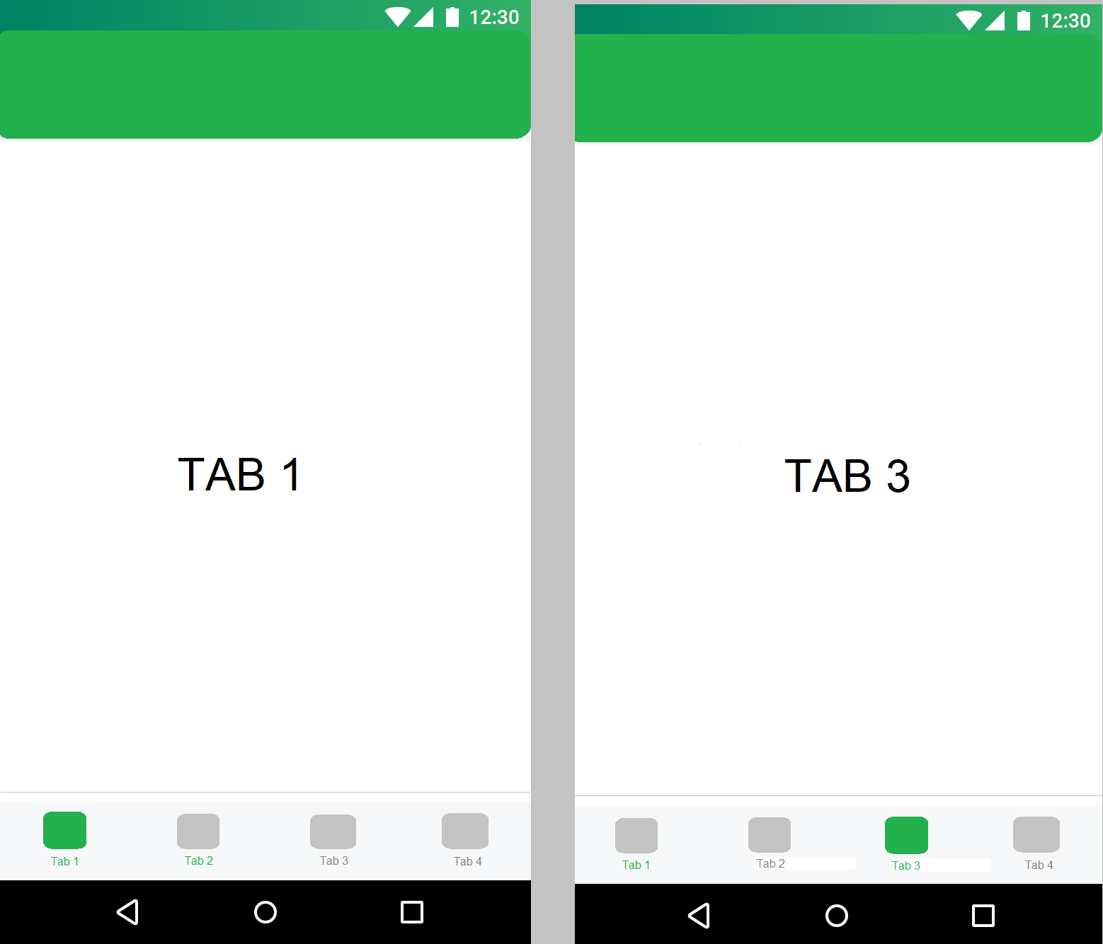
我有带有 ViewPager 的 tabLayout,但是当我选择一个选项卡时,之前选择的选项卡文本颜色也将保持选定的颜色。所以我最终得到了两个处于选定文本状态的选项卡。如您所见,我制作了 onTabSelectedListener 以将图标从选中状态更改为未选中状态,并且工作正常。只有文字是个问题。我之前也尝试过为 tabLayout 制作 xml 选择器,但最终没有用。
更新- 当我删除 tabLayout.addOnTabSelectedListener 时,文本颜色切换正确。但这仅部分解决了我的问题。现在我必须找到选择 Tab 时图标交换的解决方案。
tab.icon = getDrawable(iconListActive[viewPager.currentItem])
这个确切的代码破坏了颜色切换。但这没有意义。当我添加super.onTabSelected(tab)颜色切换时效果很好。
TabLayout 和 ViewPager 初始化:
private var pagerAdapter: ViewPagerAdapter? = null
private lateinit var viewPager: CustomViewPager
private lateinit var tabLayout: TabLayout

tabLayout = findViewById(R.id.tab_layout)
viewPager = findViewById(R.id.viewPager)

tabLayout.setTabTextColors(
                resources.getColor(R.color.color_grey),
                resources.getColor(R.color.color_green)
        )

pagerAdapter = ViewPagerAdapter(supportFragmentManager, this)
pagerAdapter!!.apply {
        addFragment(FirstFragment(), "Tab 1")
        addFragment(SecondFragment(), "Tab 2")
        addFragment(ThirdFragment(), "Tab 3")
        addFragment(FourthFragment(), "Tab 4")
    }

viewPager.adapter = pagerAdapter

tabLayout.setupWithViewPager(viewPager)
tabLayout.tabGravity = (TabLayout.GRAVITY_FILL)

tabLayout.addOnTabSelectedListener(object : TabLayout.ViewPagerOnTabSelectedListener(viewPager) {
            override fun onTabSelected(tab: TabLayout.Tab) {
                tab.icon = getDrawable(iconListActive[viewPager.currentItem])

            }

            override fun onTabUnselected(tab: TabLayout.Tab) {
                tab.icon = getDrawable(iconList[viewPager.currentItem])

            }

        })

    }
CustomViewPager
import android.content.Context
import android.support.v4.view.ViewPager
import android.util.AttributeSet
import android.view.MotionEvent


class CustomViewPager(context: Context, attributeSet: AttributeSet) : ViewPager(context, attributeSet) {

    override fun onInterceptTouchEvent(ev: MotionEvent?): Boolean {
        return false
    }

    override fun onTouchEvent(ev: MotionEvent?): Boolean {
        return false
    }
}
ViewPagerAdapter
class ViewPagerAdapter(fm: FragmentManager, private val ctx: Context) : FragmentStatePagerAdapter(fm) {

    private val fragments = ArrayList<Fragment>()
    private val tabTitles = ArrayList<String>()


    override fun getItem(position: Int): Fragment {
        return fragments[position]
    }

    override fun getCount(): Int {
        return fragments.size
    }

    fun addFragment(fragment: Fragment, tabtitle: String){
        fragments.add(fragment)
        tabTitles.add(tabtitle)
    }

    override fun getPageTitle(position: Int): CharSequence {
        return tabTitles[position]
    }
TabLayout 和 ViewPager XML
<FrameLayout
        android:id="@+id/frameContainer"
        android:layout_width="0dp"
        android:layout_height="0dp"
        app:layout_constraintBottom_toTopOf="@+id/tab_layout"
        app:layout_constraintEnd_toEndOf="parent"
        app:layout_constraintStart_toStartOf="parent"
        app:layout_constraintTop_toTopOf="parent">

        <com.app.CustomViewPager
            android:id="@+id/viewPager"
            android:layout_width="match_parent"
            android:layout_height="match_parent"
            android:background="@color/colorBackground" />
    </FrameLayout>

<android.support.design.widget.TabLayout
        android:id="@+id/tab_layout"
        style="@style/TabBarTheme"
        android:layout_width="match_parent"
        android:layout_height="wrap_content"
        android:elevation="4dp"
        android:visibility="visible"
        android:minHeight="?attr/actionBarSize"
        android:layout_alignParentBottom="true"
        app:layout_constraintBottom_toBottomOf="parent"
        app:layout_constraintEnd_toEndOf="parent"
        app:layout_constraintStart_toStartOf="parent" />
选项卡样式 XML:
<style name="TabBarTheme" parent="Widget.Design.TabLayout">
        <item name="android:background">@color/colorBackground</item>
        <item name="tabTextAppearance">@style/AppTabTextAppearance</item>
        <item name="tabIndicatorHeight">0dp</item>
    </style>

<style name="AppTabTextAppearance" parent="TextAppearance.AppCompat.Widget.ActionBar.Title.Inverse">
        <item name="textAllCaps">false</item>
        <item name="android:capitalize">words</item>
        <item name="android:textSize">10sp</item>
    </style>
该行为的图形表示(不能发布实际图形)